This is really just an update to the previous post. Having "translated" the music of Schubert's Erlkönig from G Minor to G Major, I was bothered that the text displayed was still Goethe's dark and tragic German. Although I'm not capable of re-writing the German, I decided I would translate the original into English.
As it happens, the connections between transcription and translation have been of interest to me since I started the blog, as can be seen here among many other posts. (A search of the name "Hofstadter" on the blog will turn up lots more!) But most importantly, this will work better when you inevitably feel led to sing along.
So, here we have an updated version of the story. No more "stranger danger" or creepy dancing daughters. (See Goethe's original here.) Because I'm insane, I did try to adhere pretty closely to the stanza structure of Goethe's poem, but with, for example, appropriate switches from a late night ride in the cold wind to an early ride at dawn in the breeze. Notice that, just as my "transcription" of the original Schubert song into a major key is a distortion which is nevertheless defined by the original musical structure, this new "translation" also aims to be a distortion which is nevertheless defined by the original text.
So I've been blogging and posting multimedia for more than thirteen years, and honestly there were a few times that I thought I would hit the big time. Not yet! However, my two steadiest performers over the years (the "big guns," one might say) have been two relatively simple animations I created of canons from Bach's The Musical Offering, so I knew they'd figure into these eleven days of Bach.
In fact, of the almost 900,000 YouTube views I have as of today, more than a third of them are for a video of the endlessly rising canon, the "Canon per tonos." (The title "per tonos" refers to the fact that this canon rises by a whole tone each time through.) To my great surprise, this video has amassed more than 340,000 views. My version of the crab canon has just over 200,000 views, so together, that's well over half of my YouTube audience.
Both videos are, from my point-of-view, more notable for audio tricks I played than for the animations, adorable crabs aside. For the crab canon, a single melody played against itself backwards, I actually recorded the melody only once and then reversed the audio to create the second voice. A YouTube commenter alerted me not too long after I'd posted it in 2008 that it had a wrong note in the score and recording. Ugh. Fortunately, that only took me a little over ten years to fix. That wrong note has been seen and heard many times!
As for the endlessly rising canon, I used a technique suggested by the great Douglas Hofstadter in Gödel, Escher, Bach. Because the basic structure is that the 8-bar canon modulates up a whole step each time through, a performance taken to its logical conclusion would actually run out of playable/audible pitches. Hofstadter's idea was to use the Shepard Tone technique by which the constant, gradual introduction of a lower octave occurs while the original octave fades out above. If executed correctly, the listener doesn't really notice the switch, but finds that the music, having risen an octave, is right back where it started. Here's a version of a Shepard Tone illusion created by a Wikipedia contributor:
Notice that the tones seem to be descending continuously, but they never run out of space. The effect is often compared to a barber's shop pole. Of course, applying this effect to a musical composition is something quite different.
My first attempt "to Shepard" Bach was posted more than twelve years ago, and though I'm pleased with it, I've always intended to fix some things. Among the problems with the original are a few misspelled enharmonics, the stubborn refusal to change clefs (resulting in some wacky ledger lines, although it makes the overall "rising" effect clear), and most importantly, the failure to go beyond two full times through the sequence. In the decade that has passed, there are far more novelty YouTube videos that go on for hours, and this was an obvious candidate for that approach (though I stopped at half an hour).
So, the truth is I had all these thoughts three or four days ago and figured it wouldn't take long to make a new version. As with so many projects, I mapped it out in my head and thought, "just do this, this, and this" and I'll be good to go. But I've realized that, though it's a straightforward project in many respects, the details, details, details kept multiplying. I also had to make choices about how much I wanted to copy things I'd done in the first video and where I wanted to do something different.
The two biggests tasks were recreating the score (in my beloved Lilypond) and making a new recording. I actually thought about sticking with the original acoustic guitar version, as it has a nice mellow quality that's suitable for endless listening. But I thought it would be more fun to try something new, since that video is still available. After a lot of experimenting, I felt the virtual harpsichord provided the most authentic and satisfying effect, though the sound is perhaps a little more annoying. I mean, it's a harpsichord sound. (I'll leave the Beecham jokes out of this.)
Creating the cross-fade effect is trickier than it sounds, and after much tinkering, I was also reminded how different the results can sound depending on the dynamic range of the speakers being used. But I think I've settled on something that basically does the job. It really does keep rising without going anywhere, though it's not so hard to hear why that's happening.
As for the score, I struggled over many decisions. Unlike the previous version, I finally decided NOT to use key signatures. Bach's version only shows 8 bars, which clearly start in C Minor, but with no signature. He doesn't even include the middle voice! The performers are supposed to add in the canonic voice, which follows the lower voice by one bar and a fifth above, and then work out the transpotions for each repetition.
Although key signatures are a nice way to signal change of tonality, the music is so chromatic that it actually reads a little more smoothly without key signatures since so many notes end up changed anyway, especially as the modulation is prepared for the next key. Also, after flirting with the elegance of alto clef, which mostly works beautifully for the middle voice, I finally decided to stay with treble and bass clefs only, with discreet changes along the way, simply because more people read each fluently. I did keep a couple of quirky features from before: the barlines do not connect the staves (it just looks cleaner this way) and I kept the little cue note at the end to show the new tonic that is coming.
Well, that's surely more than anyone wants to know about the endless hours I put in this week creating this endless video, so perhaps I should just finish with the video. Tomorrow, I'll write a bit more about the work itself. If the last two days focused on Bach at his mostjovial, this is surely Bach at his most austere and cerebral. And, spoiler alert: Frederick the Great's theme (on which all of The Musical Offering is based) is....not that great. But we know Bach liked a challenge....
UPDATE: The morning after posting this I listened to the whole thing while making a big breakfast - and discovered a mistake (a volume irregularity in the middle) ! It has now been fixed.
UPDATE #2: There was another mistake, but thanks to the great ears of a great friend, it has been fixed as well, along with a few other minor stylistic tweaks. Putting something this complicated out so quickly is kind of insane, but it's how I roll.
Just a bit of follow-up to recent activity here, with links aplenty.
In response to yesterday's post about "hearing four symphonies at once," the wittily wonderful Will White, conductor/composer/etc, tweeted about this epic mashup of ALL FIFTEEN Shostakovich symphonies. I'd heard of John Oswald's legendary experiments in audio re-arranging, including his layering of 24 Also Sprach Zarathustra recordings atop each other, but this Shostakovich pile-up (not by Oswald) is both zonkers and surprisingly listenably Shostakovich-y; his music often has openly spaced textures and enough spiky orchestrations that various elements come through with surprising clarity, even with so much clashing. (He also likes clashing!) The assemblers of this "performance" stretched and compressed the various movements to make them fit together, so there's yet another layer of distortion at work. I made it through the entire first movement, and though it certainly has a generally cacophonous effect, one does experience something of the intensifying progression of a symphonic structure. Sort of.
While we're on the topic of Shostakovich, I'd just like to note that when a Facebook friend posted a picture of a birthday bon-bon presented to her cryptically by DSCH (Shosty's own signature cryptogram), I deduced that Shostakovich would probably order a Double Shot Caramel Hazelnut latte for his daily Starbucks fix. A Double Shot Coffee Hot would perhaps suit his personality better, but I don't think that represents proper ordering protocol.
Finally, having cited Radiolab yesterday, I need to mention that one of the most recent episodes features my hero, Douglas Hofstadter, talking about Le Ton beau de Marot*, which is only my favorite book in the history of books. Alas, it was only a brief segment introducing a show devoted to translation, but it did offer a chance to hear the author himself reading a series of translations of the little Clément Marot poem that inspired Hostadter's enormous book. And this reminds me that, of all the dozens of Marot translations arrayed throughout the book, I'm not convinced that any are as good as my own humble effort, which I've featured here before and will point you to again.
* Le Ton beau de Marot is subtitled "In Praise of the Music of Language." That subtitle is what first attracted me to the book. I thought of it last week when I was puzzled by Terry Teachout's expression of disdain for the semicolon. (Teachout has written more about this here.) I, of course, am an inveterate user/abuser of semicolons, em-dashes, commas, parentheses, etcetera, etc. My basic defense would be that such tools make it possible to modulate written prose in a way that helps the reader follow the musical elements of a verbal composition - the rises and falls, hesitations, summations, etc. Though I resist more every year the notion that music is a language (for reasons I won't go into here), I have no hesitation in thinking of language as a kind of music, which is why the subtitle of Hofstadter's opus was and is so appealing to me. This inspired me to create my own little aphorism, which is perhaps more insightful than true:
There's nothing like a meandering path that takes you somewhere special. For example, many years ago I basically flipped a coin in choosing one musical festival over another, picked a piano trio to play, had my assigned cellist turn out not to be there, and then was assigned a new cellist...who is now my wife. We now have a daughter in music camp out in Western Massachusetts which led us to an afternoon of Sunday shopping in charming Northampton where I came across a book I've wanted to read for years. Vikram's Seth's The Golden Gate is a novel-in-verse set in 1980s Silicon Valley but modeled on Pushkin's Eugene Onegin, especially in its use of the peculiar Onegin stanzas devised by the "Russian Shakespeare." In Le Ton beau de Marot, Douglas Hofstadter raves about The Golden Gate, gateway for him to Eugene Onegin which becomes the second most important case study in Hofstadter's wide-ranging study of translation.
I've now read Eugene Onegin a few times in this dazzling translation, and I've intended to read The Golden Gate for more than a dozen years, but somehow never got around to hitting the "buy" button on Amazon or tracking it down at a local library; seeing it on the shelf at The Ravenconquered my irrational inertia, and now I'm happily flipping page after page.* My only slight disappointment is that Seth's book (or any good translation of Eugene Onegin) is a perfect candidate for e-book reading on a smartphone or tablet since each sonnet would nicely fill a screen, but it's only available in paper form. Oh well...it's still delightful even only 160 or so sonnets in. My mind is rhyming in iambic tetrameter even when I'm not reading, which is a problem I've had before.
Unfortunately, I also made the mistake of wondering if an Onegin stanza could be fit into a single, 140-character Twitter post. I remember wondering this back in #operaplot days when I successfully tweeted several limericks, but if you do the math, 140 characters divided by 14 lines leaves only 10 characters per line, and that has to include spaces and line breaks. Iambic tetrameter demands 7-9 syllables per line so it's really impossible, right?
However, it occurred to me that using texting abbreviations might make the task just possible, and OMG! (which I'd interpret as "Oh my goodness" since that yields an extra syllable), voilà:
It's pretty ugly to look at, but it's Tweetable, although Twitter doesn't really let you use line breaks, so it ends up looking like this:
I do enjoy the oddly formulaic juxtapositions of 140, 14, and 143 and the 3-line set of "TMI, IMO, MO I," not to mention that any sonnet ending with "WYSIWYG" is pretty awesome.
If you're wondering how to read it, here's a "translation." Note that every line should begin with a stressed syllable and that line 5 requires "remember" to be accented awkwardly on its first and third syllables. "Seriously" should also get a secondary stress on its third syllable.
IOU a tiny sonnet
of ≤
140; In it
14=143
IIRC
SRSLY I ineptly
had U ROTF
LOL once b4
@my TMI
No IMO my
MO I
AKA admiration
≠ U & yet
WYSIWYG
I owe you a tiny sonnet of less than or equal to one-hundred and forty; in it
Fourteen equals "I Love You." If I remember correctly seriously I ineptly
had you rolling on the floor
laughing out loud once before
at my "too much information."
No, in my opinion, my
modus operandi I
also know as admiration
does not equal you and yet
what you see is what you get.
OK, it's not Shakespeare or Pushkin...or Seth, but it sort of makes sense as a slightly desperate sonnet from a poet prone to ridiculously flowery flights of fancy. It's a bit pitiful since it seems our hero knows his recipient is a harsh critic; he's apparently trying his best to keep this tweet both short and sweet, but he is who he is.
It's also not quite an Onegin stanza since that requires iambic tetrameter which would add an extra unstressed syllable to the beginning of each line, but chopping off those 14 syllables was really helpful. The astute among you will further note that I've interpreted AKA as "also know as" instead of "also known as." So sue me. My first line takes up a luxurious 24 characters, and I had to find as many ways as possible to abbreviate thereafter. Honestly, I don't think I'd have pulled it off without that "less than or equal to" sign. That's six syllables of pure, 1-character gold.
I later realized I hadn't even thought about abbreviated proper nouns like UK, USA, IBM, etc., but textspeak is a perfect fit for Twitter anyway. Still, I think this is my first and last Onegin sonnet of 140 characters or less.
But I also wondered about a trimmer-style sonnet, and fairly quickly managed the following (I was home sick yesterday, so I had a little time on my hands):
...this actually comes in at a highly efficient 134 characters. Note that I've kept the Onegin stanza rhyme-scheme with its charming variety of masculine and feminine rhymes. For those not in the Twitter know, "RT's" stands for "Re-tweets," which is the Twitter way of sharing posts. Also, you'll note that "140" in this case should be pronounced as "One forty." It's true that this rhyme scheme has quite a different flavor than Eugene Onegin with only 2-3 beats per line; in fact, in this regard the poem is much closer in spirit to Clement Marot's A une Damoyselle malade, the 28-liner beginning and ending with "Ma mignonne" that is the central case study in Hofstadter's book.
My favorite felicitous detail in my "Mignonegin" sonnet comes with the phrase "li'l more than / 3 beats"; I chose "li'l" to create a nice triple rhyme with "will pour in" but was slightly bothered by the fact that none of the lines actually has any more than 3 beats. EXCEPT, one could say that the contraction "li'l" has perhaps a little more than one syllable, meaning the phrase "li'l more than" contains something like pi beats; it thus becomes the very line to which it refers. I realized that while struggling through the last leg of my morning run, and that put a much-needed hop in my step.
* I could quote favorite turns of phrase for days, but here's one of Seth's couplets that I particularly admire:
Thus by default the fault is Phil's.
Jan sets her gaze at Look that Kills.
I'm fond of saying to students that a musical score is just a set of instructions. Indeed, one of my Music Ed colleagues doesn't even like to refer to sheet music as "music," preferring to have her children's choirs look at their "notation." After all, all those dots and lines don't actually produce any sound on their own. They're not music. Still, I don't mind referring to these instructions as "music" since the word has clearly inherited that additional meaning. "Notation" sounds cold and too distanced from the music that is somehow magically embedded on paper. (Of course, "notation" "sounds cold" because I'm not used to using it this way; language gets much of its flavor from experience.)
Perhaps notation isn't the same thing as music, but there's still something aesthetically satisfying about these "instructions," even when we don't get to hear music. This, of course, has a lot to do with the meanings suggested by all those dots and lines. I love sightreading, I love studying scores, I love the dozen or so anthologies of scores aligned on a bookshelf above my desk, I love looking at all the other scores filling a large bookshelf nearby, I even love the digital joys of IMSLP. It stands to reason that notes themselves might start to appear beautiful, if only by association.
I wrote a few years ago about the pleasure of following a score while listening, with the idea being that watching the notes go by can be a good catalyst for listening (even for the uninitiated). But I also find that notes can be worth looking at simply for their own suggestive kinds of beauty. By suggestive, I especially mean the reference to particular sounds and patterns, which is why I find it annoying when musical signs are just tossed around like Clip Art. [e.g. the lazy use of musical notes in this disappointing Google logo.] See how I'm dancing back and forth between saying musical notation is beautiful on its own and yet stressing that "beautiful on its own" is connected to what the notes mean as music. It's a Hofstadter-y "strange loop."
Words, words, words. Mainly, I just came here today to talk about a couple of images I created to personalize my Facebook page. The truth is, Facebook is notably uniform and bland in its look - which is mostly a good thing. (MySpace was a visual disaster because approximately 93% of people shouldn't be given free reign over choices about graphic design.) However, every now and then the Facebook gods throw us a design curve that provides the tiny potential for some creativity.
When, in 2011, they rolled out the "photo-strip" header at the top of profile pages, I was first just annoyed. The idea was that the five photos in which one was most recently tagged would become a little Muybridge-esque visual time capsule...
Muybridge
Facebook Photostrip
...with the added surprise that you never knew when someone might tag some 2nd grade picture of you that would suddenly be part of your banner story.
Come to think of it, I'm now disappointed that I never thought to use either of the first two just-created dummy photostrips for my page. But what I did do was decide that those five tagged photos might look cool if they became five measures of music. (This meant tagging myself in these score images and then vigilantly un-checking new photos in which I was tagged.) For some reason, I ultimately decided on the hypnotic opening of Scriabin's Vers la flamme, a piece I've never played, although I intend to. (I have, elsewhere, claimed Scriabin and Poulenc as the composers I like most above their reputations.) Vers la flamme is about as sensual (in the sense of creating a presence that can be felt) as music gets, so maybe that's why I was inspired to objectify it as image.
Like so many of my projects (like this very post!), this ended up taking longer than I intended since getting the measures to be equal lengths required putting the music into Finale (and, sadly, leaving out the pick-up notes). But this five measure group works well as an entity because the arrival at the fifth bar kind of lets us know this piece is going strange places.
Here are those measures as they appear in the score:
And here's what they looked like atop my Facebook page:
Elegant, mysterious, and....yes, just a tiny bit pretentious in its coded, insider messaging. ("What you don't recognize this music? You must not be as smart as I!")
But then, of course, Facebook comes along with this new Timeline feature and suddenly the photostrip was being phased out. I finally got the word this week that my page was automatically going to be converted to the new Timeline format, which replaces the "at least it's small" photostrip with a huge header of a photo (of the user's choosing). These photos take up way too much screen real estate and they're also oddly paired with a small, nested version of the user's profile pic. Thus, I'd avoided making the switch for months, both because I liked my little bit of Scriabin and because I was opposed to this clunky new look. But, it's a free service, so you get what you pay for - which, in this case, is not much choice.
After some playing around with images of piano keyboards, I finally ended up with the following as my new banner image:
[click to view larger]
It's not perfect - maybe a little overstuffed, but I like its painterly look and, of course, you will see that I couldn't give up my Scriabin signature, now heading right towards us due to some simple 3-D rendering. The m.5 chord looks even more ominous now with the notes getting progressively larger. I'm also pleased with the way the notes are poised in the air like ghosts (if you rotate your screen away from you, the notes will likely disappear!), although in an ideal world the bass clef notes floating over the keys would be a bit darker. Are these notes left over from a past performance? Are they waiting to be played? Are they happening right now (all five measures at once?)?
So that's today's story of music as image. Facebook remains annoying, but sometimes crazy constraints inspire unexpected creativity; for me at least, Scriabin's notes add multiple layers of texture that seem to bring the keys to life. Those who are reading on my actual blog (as opposed to in a feed-reader) will also "note" that my homemade template has featured Bach's notes as background image almost since the beginning. (A few of you may remember MMmusing's "Yellow" period.) I created that looping image of Bach's Invention in A Minor for another website way back in the early days of the Internet, but I think it still holds up. (Bach, of course, is great for looping, which is how he made it into Hofstadter's Gödel, Escher, Bach.) Ironically, I worked hard to distort those notes to make them look like refugees from some ancient manuscript, and now they are getting ancient, at least in web terms.
Finally, note that my attraction to notes as images is based to some degree on my understanding that notes really are music, in a mystical sort of way. In his fascinating book Musicophilia, Oliver Sacks uses the term "musical imaging" to describe the way in which we can "hear" sounds in our imaginations - and only after typing that sentence did I think that the word "image" is embedded in the word "imagination." So we now have a strange loop in which musical notes are understood as images that inspire internal musical imaging, and thus became images that can inspire the imagination even more than mere images.
So, I've provided a vague sort of intro to Douglas Hofstadter's Le Ton beau de Marotand plenty of passing references in posts this summer; it's time to unveil its central "character" and the first poetic response that it inspired from me. As I mentioned last time, Hofstadter's sprawling book was generated by a tiny little poem from the 16th century French poet, Clément Marot. Hofstadter was intrigued by the question of how such a poem might be translated into English, especially considering all the tight constraints imposed by the medium. He ended up writing more than 600 pages about this question. There are, of course, reasons to translate a poem literally (whatever that means), with concern only for the meanings (whatever that means) of the words, but an important point is that the meaning of this poem is clearly embedded, in part, in its poetic elements. A word-for-word translation is only a partial translation at best.
Still, before I reveal my first translation, it makes sense to include, along with the original poem, one of Hofstadter's "word-for-word" translations so that you can appreciate some of what is going on in Marot's charming creation. The poem was written to cheer up a young girl who'd fallen ill. It is quite lighthearted in tone, but beautifully crafted. Hofstadter, in sending the translation challenge out to his friends and colleagues, identified the following eight structural features that deserve consideration:
It is made up of 28 lines.
Each line has 3 syllables.
The stress falls on the last of these syllables.
It is a series of rhyming couplets.
The semantic couplets are out of phase with the rhyming couplets.
After line 14 the formal "vous" is replaced by the more colloquial "tu".
The last line echoes the first.
The poet slips his own name into the poem.
Actually, Hofstadter originally left out #5, an oversight which surprised me greatly. That lovely cross-rhythm is a key feature that jumped right out at me. (On the other hand, I might easily have missed #6.) Even when one of Hofstadter's colleagues first points out that the rhymes are out of phrase with the semantic couplets, he expresses some hesitation* about whether this property is essential or even intended by Marot. Hofstadter is an avid amateur musician and subtitles his book "In Praise of the Music of Language," so it's odd to me that this particularly musical quality escaped his notice, but it also shows how differently we can hear the same thing. (I probably took extra delight in having out-perceived Hofstadter since his general, wide-ranging brilliance is so intimidating. I do have quite a few other disagreements with his ideas, but I'm saving those for later posts. He's still "the man!")
Anyway, I was quite surprised that on first reading I felt compelled to take up his challenge right away, before reading a single "real" translation. There are dozens and dozens in the book, including dozens by Hofstadter himself, and his own translations of translations others made into languages other than English. (This book will wear you out!) The book is structured so that each chapter is followed by a series of related translations. My hope over the next few months is to continue exploring Hofstadter's book from many angles (especially with respect to musical implications), interspersed with little intermezzo posts featuring various poems I wrote while first reading this book back in 1998. (Too bad I wasn't blogging then, though I was emailing my little creations out to my poor family.) So, I present here my very first translation of Marot's A une Damoyselle malade ("To a Sick Damsel").
To see it, you'll need to highlight the invisible text in the third column. [Of course, you should try translating it yourself first.] You can also go see it here.
Marot
Ma mignonne,
Je vous donne
Le bon jour;
Le séjour
C’est prison.
Guérison
Recouvrez,
Puis ouvrez
Votre porte
Et qu’on sorte
Vitement,
Car Clément
Le vous mande.
Va, friande
De ta bouche,
Qui se couche
En danger
Pour manger
Confitures;
Si tu dures
Trop malade,
Couleur fade
Tu prendras,
Et perdras
L’embonpoint.
Dieu te doint
Santé bonne,
Ma mignonne.
Hofstadter
My sweet
I bid you
A good day;
The stay
Is prison.
Health
Recover,
Then open
Your door,
And go out
Quickly,
For Clément
Tells you to.
Go, indulger
Of thy mouth,
Lying abed
In danger,
Off to eat
Fruit preserves;
If thou stay’st
Too sick,
Pale shade
Thou wilt acquire,
And wilt lose
Thy plump form.
God grant thee
Good health,
My sweet.
Monroe My delight, I invite you to smile; For awhile you¹ve been jailed. Find your failed health again. Open then the cruel door to explore right away, for I say you’ve no choice. Go, rejoice, since your tastes lay in waste while you’re ill; Have your fill, cakes devour! Ev'ry hour sickness wins, color thins from your face, to displace roundedness. May God bless you tonight, My delight.
It's not perfect, but I'm rather proud of it as a first effort. I actually prefer it to most of the ones found in Hofstadter's book, but I may be biased...
If you're just dying to read more of my tortured rhymes, there are links to quite a few at the end of this post.
* Hofstadter writes: "...couldn't [this "out of phase" property] be pure chance, something Marot never intended or even realized, but that just by accident came out that way? Of course that's conceivable, though hard to believe." (11a) I find it inconceivable that Marot didn't intend this. It gives the poem a kind of forward momentum since each completed rhyme is only halfway through a thought - and when the thought is completed, the ear knows that another rhyme is around the bend.
I’ve made many passing references this blogging summer to Douglas Hofstadter’sLe Ton beau de Marot,a book which I’ve said changed my life. The book first attracted my interest when I was trying to find a dissertation topic back in the late 90’s. Since I was in the process of metamorphosing from a pianist into acollaborative pianist*, I had become quite interested in the subject of musical transcriptions. After all, I was often spending hours a day pretending to be an orchestra accompanying concerti, arias, opera scenes, oratorios, etc. – and I loved being an orchestra. Come to think of it, my first deep attraction to music came when I took up the cello and joined my junior high school orchestra; seeing how parts fit together this way had an important catalytic impact on my theretofore casual piano studies. So, perhaps it makes sense that my piano training led me back to the “orchestra.”
And those scare quotes around “orchestra” are what, for awhile, I hoped to dissert about. I was and still am intrigued by what it means to have some core identity of a musical work shapeshift from the product of 100 musicians to 10 fingers. It says a lot about how Western music has been constructed that we so often accept this transfer from one media to another, even though we know something always gets lost in translation. Although piano reductions have long served utilitarian purposes, I thought there should be more literature addressing this curious art as art.
So when I saw that Hofstadter, author of the wonderfully interdisciplinaryGödel, Escher, Bach, had written a book about the art of translating art (in this case, poetry), subtitled “In Praise of the Music of Language,” I read it with great anticipation. (You might say I hoped to write a similar book about translating music, perhaps subtitled "In Praise of the Language of Music.") The surprising thing is that I became so interested in poetic translation that my dissertation topic shifted into the process of translating a French operetta libretto into English (while also “translating” a fairly standard orchestration into a chamber version). The aesthetics of piano reductions continued more as a side interest, something I still hope to explore more fully some day.
Well, that day has not yet fully arrived, but I've brought a small-scale case study. Hofstadter’s book is all about translating a tiny, tightly constructed French poem into English. (You'll see a few of my translations in future posts. UPDATE: See these translations here.) Most of the 600-plus pages flow out of questions about just what a translator should prioritize when transferring this "information" from language to another. Is it primarily a matter of getting the same ideas across? What about the rhymes? Meter? Alliteration? Does every line have to match up exactly, or can ideas move from one place in the poem to another? Medium vs. Message? Robert Frost famously said that "poetry is what gets lost in translation," but Hofstadter disagrees pretty strongly, just as I feel pretty strongly that a big concerto can still be very satisfying with only piano accompaniment. Yet, I'm sure we can all agree that there are times when a translation fails in some fundamental way.
So, to my case-study. My daughter started working on Prokofiev's first violin concerto this summer. I'm not sure why, but it's a piece I've never really gotten to know well, although I heard Hilary Hahn slice and dice it in absolutely glorious fashion with the BSO a couple of years ago. (The more popular second concerto I've known for years and accompanied - er, served as its "orchestra" - many times.) I've written before about how when Daughter of MMmusing is studying a piece, I tend to like it more than expected and that the enthusiasm often wears off when she's moved on, but I'm pretty sure this "new to me" Prokofiev is a keeper. I've fallen head over heels in love with it, and for now, it seems like the most perfect and special of all concertos. (And I LOVE the violin concerto repertoire.)
One of its most magical and fairly unique features is the way the first and final movements end in almost exactly the same way. In the first movement, the closing section has featured the flute playing [7:50] the melody (see above) with which the soloist had opened [0:15] the concerto, the flute line now embroidered by intricate violin filigree; in the final movement, the violin itself revisits the same tune [19:44], trilling every note ethereally. In both movements, the closing section leads the soloist up to a high D [I: 9:25 III: 21:28], and then a few echoes of the rising fourth (A-D) that first generated the melody. Beneath this stratospheric rocking motion, the flute introduces a quirky, rising figure outlining F-sharp minor and thus emphasizing a C-sharp against the tonic D Major chord, with an even stranger clarinet line snaking up chromatically below. These flute and clarinet lines seem to have wandered in from some other concerto.
[click to view larger]
So, there's resolution mixed with the unexpected, heavenly serenity mixed with earthy sensuality. When the violin finally lands on the last high D, the flute slithers up an exotic scale from its lowest reaches. One could easily argue that this flute line is less about melody or harmony or even rhythm than it is about color – the piece is basically over, but it’s as if this final resolution (and new vantage point) unearths a curious new discovery. I don’t hear the ending as subversive or deceptive, although it could be interpreted that way, but rather as an unexpected heavenly reward, a little bit of earth come to color the sky.
That’s about as sappy a musical description as I’ve ever attempted here on the blog (I hope), and it’s much too wordy. A musical picture may be worth a thousand words, but who wants to read a thousand words about five seconds? The point is, this flute line is both superficial and essential to the character of the ending.
Here’s what it looks and sounds like in the score (slightly simplified to make these parts easier to read; note that this is a synthesized performance - not bad for virtual reality!).
[for some reason, clarinet audio is barely audible in transfer to YouTube; will fix soon.]
And here’s what those three bars look and sound like in the published
piano reduction I have:
All the good stuff is gone, especially in the final bar! Nothing but D Major arpeggios ascending upwards, a completely different effect. In the previous two bars, rather than play the distinctive rhythm of the flute, the pianist is given a bare outline that was originally played by the harp, but clearly subsidiary to the flute line.
There are all sorts of legitimate philosophies about what to leave out in a piano reduction, and all sorts of practical reasons to leave out even the most beloved little orchestral touches, but I can’t imagine the mindset that says those flute lines are expendable. It’s the end, the culmination, the reward, the final thought. The ending of the piece in the piano version above is missing the ending – like getting to heaven and finding it predictable and a little dull. It’s true that a piano can only begin to approximate the special color of a flute in that register. In fact, this concerto as a whole has many lovely chamber-like moments when only a few instruments are audible (clarinet, flute, and harp especially) and a piano can only begin to suggest what Prokofiev had in mind, but we collaborative pianists are all about suggesting. The fact is, it’s not very hard to play that little flute scale, and I will certainly do it when performances come around.
On the other hand, I would probably leave out the clarinet line (because it would be hard!), even though it also adds something unique, so there's a sliding scale in play. Hopefully it would come out something like this, though a real piano can do more shimmering (or so I choose to believe) than you get here.
Actually, after years of thinking I wanted to create my own piano transcriptions, I’ve realized that as a performer, I care less and less about exactly how things are rendered on the page, because I’m more and more likely to use my in-the-moment instincts to make decisions about what to play, how to pedal, etc. I think I’d drive myself crazy trying to get all these little decisions notated, and I suspect that the subtleties of touch and pedaling have more to do with a good “black and white orchestration” than what is printed on the page. (Trying to get that L.H. tremolo to sound decent with synths was much harder than getting the other instruments to sound real-ish.) But I do think this art of translation is worth pursuing as well as possible. I realize that whoever transcribed the Prokofiev above may have thought of the reduction as little more than a rehearsal dummy to let the violinist feel how things synch up, but endings matter. And that's the end of this post.
P.S. It's never totally clear to me how many people are interested in this kind of musical minutiae (I just wrote a lot of words about three bars of music), but if this post has inspired you either to get to know Prokofiev's first violin concerto or to explore Hofstadter's Le Ton beau de Marot, then I will have accomplished something. I genuinely think these are two of the most sparkling monuments of the 20th century. * I used "scare italics" to put a skeptical tone on this notion that a "collaborative pianist" is somehow different from a "pianist." Personally, I don't even mind being called an "accompanist!" Note the combo "scare quotes, italics, and exclamation point" to suggest just how volatile this word has become. Also note that, although I'm sure many writers and editors would say I use way too many parentheticals, hyphens, italics for emphasis, and scare quotes for eyebrow-raising, I think all these elements can help clarify the language being used.
It also occurs to me that, just as Hofstadter talks about translation as a kind of analogy-game (e.g. "jeux is a French analogy for 'game'"), scare quotes and the like can be a way of clarifying that a word is being used in a particularly analogical way. When I say that I am a pianist being an "orchestra," I want to say more than that I'm playing the orchestra part, but less than that I'm becoming dozens of people. I'm actually acting as an analogy for the orchestra. And if I do a good job, then like a good poetic translation, I have managed to keep from losing all of the art in the process of translation. (By the way, Hofstadter begins his great book noting that "Lost in an Art" is an anagram of "Translation.")
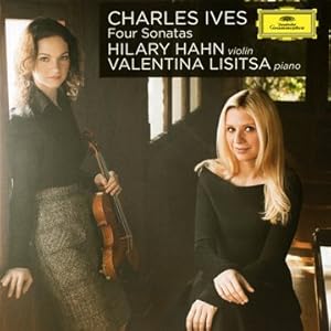
So, there was this online contest to design the best new album cover for a highly regarded classical CD. The contest promised lots of money and high-profile opportunities for the winner. Thus, I suddenly got hooked on the art of designing CD covers and ended up with a pretty cool Hahn/Lisitsa/Ives CD cover that won me first prize, $1000, and a job as head of marketing at Deutsche Grammophon.
Unfortunately, the only part of that paragraph that's true is the "I suddenly got hooked on the art of designing CD covers" part. This is likely a passing phase, but as I detailed in our last episode, a Proper Discord sampling of text-driven album covers got me interested in trying to create pictures with words. I gave that post the clever title, "A few words = A picture = A thousand words," which of course implies that "A few words = A thousand words." Obviously, there are some problems with my math. Aside from the unsettled question of just how many words it really takes to equal a picture, the slippery part of my equation is to consider these "few words" as just words. In fact, many of the "text-driven" covers are just as much driven by elements of graphic design, which is to say that the words are serving as pictures. There's a kind of slippage between medium and message going on, as my hero Douglas Hofstadter would say; in fact, words often (usually...or, perhaps, always) do more than just stand in for specific ideas, people, etc.
They may not always function as pictures, but they also have sonic qualities which can become musical (some might say "poetic"), whether it's via rhyme, meter, alliteration, etc. Words might also have structural properties that create meaningful patterns - like the fact that the following "words" can be interlaced into a fairly tight crossword pattern: Hilary - Hahn - Valentina - Lisitsa - Ives - Violin - Sonatas. So, there are plenty of ways in which a few words might say more than just a few words. They can also say less, but that's a subject for another day.
When I condensed the "Minute Waltz" down to a minute, inspired by its much-maligned title (maligned because people inevitably read mi-'nute as 'mi-nute), I mentioned that I was translating this piece into the "medium of pieces that last 60 seconds." Aside from providing a good excuse for my mischief, it also reminds us that a medium can often be of interest in part due to its defining constraints, another pet Hofstadter topic. Sonnets, haiku, palindromes, acrostics, canons, piano pieces for left hand alone, piano pieces that last exactly a minute: they all offer a special framework which will likely exert a strong influence on the receiver beyond the mere words or pitches. The medium becomes part of the meaning.
And speaking of media, how about the "CD album cover with no artist photos" as medium? When I created my first text-driven cover, I was inspired by the much-maligned font Comic Sans to create a little dialogue with the person holding the CD:
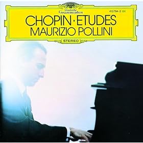
Though it's not a very good translation of Chopin's music (or a very good picture), it's actually a pretty good translation of the subliminal message such CDs used to exert on me. The digital world means I don't buy many CDs these days, but I still have vivid memories of standing in Tower Records on Pennsylvania Av. in Washington, D.C. holding various CDs in hand and trying to figure out what I could afford to take home. And, yes, an image of someone like the legendary Maurizio Pollini on a cover (or even just the image created by the letters of his name) could exert a mystical kind of hold on me. Of course, I would've been insulted to have an album cover openly saying what I was thinking, which is why the subliminal works better than the superliminal.
...but I'd say my cover is a pretty accurate translation!
OK, but how about an even more restricted medium - the medium of CD album covers that resemble medicine labels? Pretty strange way to go, but Hofstadter's Le Ton beau de Marot has many examples of seemingly arbitrary constraints into which ideas are poured. Check out this curious bit of poetry:
Washington Crossing the Delaware
A hard, howling, tossing water scene.
Strong tide was washing hero clean.
"How cold!" Weather stings as in anger.
O Silent night shows war ace danger!
The cold waters swashing on in rage.
Redcoats warn slow his hint engage.
When star general's action wish'd "Go!"
He saw his ragged continentals row.
Ah, he stands – sailor crew went going.
And so this general watches rowing.
He hastens – winter again grows cold.
A wet crew gain Hessian stronghold.
George can't lose war with's hands in;
He's astern – so go alight, crew, and win!
Not the most elegant of sonnets, perhaps even uglier than the average medicine label - until you consider that every single line is an anagram of the poem's title! I know, right?
I cheated a little bit with my "medicine CD" (see below) by making up my own imaginary recording, though a recording of these Bellini songs does exist. I also cheated by indulging in some superliminal counter-marketing on my cover ("may cause drowsiness," etc.) because it was just more fun that way. Otherwise, I tried pretty hard to work within my self-imposed constraint: create a "working" album cover that looks like a medicine label. It's nice that Bellini actually sounds like the kind of name a drug company might give a product with a mouthful of a generic name like Composizioni da camera. I also had some fun inventing the ominous sounding company LaSonn Ambula (Google Translator tells me Ambula means "outpatient!"), which somehow reminds me of the fictitious drug conglomerate Devlin McGregor from The Fugitive - and which also happens to be the name of one of Bellini's most famous operas.
Since that opera is about a sleepwalker, it ties in nicely with the idea that Bellini® is a sort of natural Ambien - at least for pianists. Note that the pianist in this "recording" is named after a famous Puccini aria about not sleeping, so even the imaginary pianist has been translated into this druggy world; Giuditta Pasta is not imaginary, though also not available for recordings; she is the singer who debuted the role of the sleepwalking soprano in 1831, which I might have included as the expiration date on these songs if I'd been more clever.
If medicine label CD covers is too far for you as a worthwhile medium, let's re-visit my crossword design from the last post:
Though it's coincidental, surely there's some value in seeing all these lovely words cross so nicely, a sort of graphic representation of what happens when a phenomenally talented fiddler and pianist cross paths with a great composer. However, as an album cover it's a bit bland, so I decided it might be nice to cross this "word image" with some photos, and here we have my award-winning final design:
You might say (might...) it's my own "cover" of this cover:
Over at Proper Discord, there's a nice selection of album covers that get by without photos of the performing artists or reproductions of French Impressionist landscapes. Pure, text-driven covers, abstractly rendered with elegant fonts and color schemes. Here are just a few:
My first, silly Twitter impulse was to take this concept to the absurd extreme by featuring that most disparaged of fonts, Comic Sans. This quickly led to the idea of comic strip bubbles imploring the browser to buy the CD in question:
Ah, the glories of MS Paint.
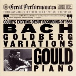
A little later in the day, I re-visited a design I've used on many a last-minute (or last-minute looking) recital poster: Stenciled text on brown shipping paper. (Vaguely reminiscent, at least in color scheme, of this old CBS Masterworks design; I had dozens of those "Great Performances" LPs.)
What I found most rewarding about this one is noticing for the first time how closely related "Gould Bach" and "Gold Berg" are as word pairs. (Hofstadter would love this kind of insight via interplay of medium and message.)
Somehow, my mind then went to one of the ugliest of text-driven layout genres: the medicine label. As soon as the phrase "may cause drowsiness" popped into my head, I knew this had to happen. After a little image Googling, I decided this had the right look:
On the subject of drowsiness, I decided nothing excites me less as a pianist than hearing a singer say, "Oh, I'm going to be doing a set of songs by {insert one: Verdi, Bellini, Donizetti, Rossini}" because they all write deadly dull piano parts. Bellini won, partly because Composizioni da Camerahas the right imposingly generic ring.
Take two and call me in the morning...
UPDATE: Here's another text-driven idea. The look could be improved, but I'm pretty proud of getting so many letters interlaced. It's a better design than this:
UPDATE: A fancier version of the Ives/Hahn/Lisitsa cover appears in the next post.
That last post was supposed to be an introduction to these new "Minute Waltz" videos, but the introduction became its own unwieldy post - so back to some lighthearted Chopin, and some even more lighthearted "interpretations." As I anticipated, my "Minute Waltz in a minute video" inspired some tsk-tsk'ing. A Twitter follower commented:
Impressive, yes. like it? no. There is no time to enjoy the melody and harmony. Don't think Mozart would like it.
I suppose I can't really disagree with this assessment, but I'd still like to pick it apart a bit, if only to help answer the question of why I accelerated Chopin's poor little waltz in the first place.
First of all: Impressive? I'd say, "No." I just took some audio from a poor, hard-working pianist who'd done the work of learning the notes and interpreting them with sublime artistry, I hit a virtual switch and, voilà, 108 seconds was sliced to 60. At least this guy you see below worked with real fingers in real time (notice by the way how he, too, feels compelled to post multiple disclaimers ahead of time [you have to turn the annotations on], just as I did in my previous Chopin post; the moral highground is pretty intimidating in classical music):
As for my video, I'm more impressed with the nifty visualization, with its time counter, sweeping second hand, sweeping composer eyes, and newly added spinning score - they all provide useful visual analogues for thinking about this as a high-stakes, one-minute event.
But our concept of impressive is significantly based on an understanding that a real person with real fingers has played all those notes in time, and most of us can instinctively tell that this performance isn't real. It's too fast to be impressive! As it happens, my very first two blog posts (ever) focused on related topics: 1) my debut post about the Joyce Hatto scandal stressed how much our listening is colored by what we know or think we know about the performers, and 2) my second post discussed how much musical meaning can be shaped by our understanding of the technical challenges involved. It's hard to evaluate such music outside the context of how humans can and ought (?) to play. (That parenthetical question mark indicates my eyebrows being raised suspiciously.)
Now, as for the objection raised above: "There is no time to enjoy the melody and harmony. Don't think Mozart would like it." We can dismiss the Mozart point, because who knows? (Although I think Mozart would've liked it.) But what about this "no time" to enjoy the melody/harmony? First of all, this piece does not feature any particularly noteworthy harmonies (not by Chopin's standards) and they only change once per bar, which isn't that fast, even when accelerated. More to the point, we all know the melody and harmonies quite well, so certainly we can take them in a little more quickly than usual. Of course, the "no time to enjoy" really is code for "there isn't the optimal amount of time to enjoy," and it's a fascinating topic in itself how often reviewers (myself included) use this kind of all-or-nothing language to describe something less than ideal. It's also curious how we train ourselves to think that the "optimal time" should be a constant, no wonder how well a work is known.*
I think part of what's going on is that the almost unreal tempo sends a message to our brain that musicality is being sacrificed for velocity, but is that the case here? The performance I stole is beautifully proportioned and features several moments of rubato, so even well above the speed limit, there's still time taken to take in the scenery. Proportionally, this is not at all a rushed performance - rather, its particulars have been translated to a different time frame. This brings me back to some of the issues raised in Douglas Hofstadter's Le Ton beau de Marot. Rather than transposing this waltz for violin or tuba quartet, Hofstadter might say it's been translated to the medium of "pieces that last 60 seconds." (By the way, several of Chopin's preludes come in easily under a minute. Go to the iTunes store, and you can listen to all 24 seconds of Op. 24/10 for free within the 30-second preview limit.) Maybe if you drink enough coffee before listening, the medium will be just right.
Still, why translate this piece to such a medium when Chopin definitely never intended it to last a minute? I'd say there's some poetic justice here. There's little doubt that this waltz has received exponentially more performances and notoriety than it would have if it were known only as Waltz in D-flat Major, Op. 64, No1. Well, Mr. Op.64/1, you gotta take the good with the bad. The association of this music with 60 seconds may be unfair, but the title is so culturally ingrained, it's hard not to think about it as a one-minute ride, just as it's hard to disassociate Beethoven's Op.27/2 from moonlight - and, as often, there's some truth in the stubborn title; turning it into a minute waltz is on the edge of possibility, even it leaves little opportunity for musical subtlety, at least for us humans. [Impudent Question(s): Why does everything have to be so subtle anyway? Can't Chopin just let loose every now and then?] Virtual engineering makes it more than possible, so why not give it a try? It would be almost crazy if I didn't do this.
You may recall Stephen Hough complaining that "it's impossible to play [this piece] in 60 seconds unless you crash brutally, meaninglessly through the central section," but I couldn't help noticing how unhurried that section is in my video above; could I borrow some time from there to ease up the outer sections? So, I played around with the tempi just a little, slowing up the outer sections and speeding up the middle so that they end up being closer to the same pulse; I hoped this would make the outer sections seem a bit more realistic, but I think more harm is done than good as the middle section really does seem too giddy now, if not brutal. Here's what this more tampered version sounds like:
Unfortunately, this now left me with two different interpretations of the piece that each last exactly 60 seconds, but with different interior proportions. How could I resist playing them simultaneously? Thus, in the video below, we have the following going on with reference to the ABA structure:
Top Score/Right Channel: proportions are roughly 22+16+22
Bottom Score/Left Channel: proportions are roughly 20+20+20
It's not clear to me if I'm the only person in the world who gets such a kick out of this kind of thing, but I find it genuinely gratifying to listen to and watch. It is, in some respects, a kind of mensuration canon (same tune moving at two different speeds), though without anything like the meticulously worked-out vertical intersections conjured by Ockeghem and others. There is also an analogy to the kinds of phasing techniques pioneered by Steve Reich, but again, without nearly the same attention to detail. (There's also an analogy to viola duets, but let's not go there...)
And yet, the sound of the two parts chasing after each other is invigorating and, I believe, can provide the same kind of pleasure in following multiple melodic strands as more traditional counterpoint. I especially enjoy hearing the parts join together briefly at the midway point and the extra long trill starting at 0:35 is cool, too. At other times, it's just like a kooky echo chamber; listen to that almost-together run at the end. And even if you hate it, it's only a minute of your time.
If you do like it, you might want to sample the following from my shady past:
Canon a 2 Tempi - Maria Callas and Renée Fleming have a Puccini race.
* There's good reason for thinking an optimal tempo should be constant; in the classical tradition especially (though broadly true for most traditions), music exists in time in this sort of eternal new, even though we so often listen to music that's old and familiar. Thus, that deceptive cadence or that rhythmic disruption can be "surprising" every time, even though it's not really surprising at all. (See just about everything I've ever written about The Rite of Spring. Of course, this can also be true of events in novels, films, etc.) In fact, an effective performance is often judged on its capacity to get these fully expected "in the moment" moments just right, and sometimes a microsecond's difference of timing or a tiny shading of timbre will cause a reviewer/listener to say a theme was not given "time" to breathe. And (I think) the better the listener knows the music, the more likely he/she is to insist that the spontaneous moment conform to a preconceived notion of how it should be executed so that it sounds spontaneous. Such notions are conditioned, to some degree, by virtually everything that's ever happened in our musical past, both personal and culturally. This merging of past and present is not unlike those Douglas Hofstadter's self-referential loops, which loops us back to the previous post.
My Blogger profile mentions that reading Douglas Hofstadter's Le ton beau de Marot changed my life. (I began another post exactly the same way five years ago, just to be self-referential.) My profile goes on to say, "I also like exploring other creative pursuits such as...writing poetry that rhymes; and creating effective translations (yes that's creative!)." I can say almost for certain that I would've written a lot fewer poems were it not for Hofstadter. Why, just three posts ago (which I'm embarrassed to say was three months ago), I blogged about a set of sonnets I wrote for my daughter, and that post includes links to quite a few other bits of MMrhyming. I also would surely never have embarked upon and completed a full translation of a French operetta into singable (I hope), rhyming English had I not read this book. The operetta is Gounod's The Doctor in Spite of Himself, and that translation had much to do with me becoming a doctor in spite of myself. That's a kind of self-referential loop that Hofstadter would love.
Hofstadter is most famous for another sprawling, crazy-brilliant work, the Pulitzer Prize-winning (1980) Gödel, Escher, Bach, which I have to admit I've never quite finished, though I've started it many times. It's all about self-referential loops such as Bach's Crab Canon, Escher's loopy drawings, and Gödel's "Incompleteness Theorem." But, it's really about consciousness, and the ways in which our minds (in Hofstadter's view) arise from incredibly intricate, self-referential patterns - sort of; remember, I never finished the book! (The Gödel math stuff is pretty complicated - so many symbols.)
Le Ton beau de Marot debuted in 1997, tackling some of the same questions through the prism of language. I first read it in 1998 and I just finished my second reading yesterday. Though critical consensus seems to hold that it is a lesser book than Gödel, Escher, Bach, I strongly disagree. I find its every page to be inspiring in a way that makes the mind dance which, by the way, is what music does as well. The book happens to be subtitled "In Praise of the Music of Language," and I was first drawn to it by that subtitle, and because I was becoming interesting in philosophical questions concerting musical transcriptions. Hofstadter's book is all about linguistic translations, which I (more than Hofstadter, as I'll discuss in posts to come) see as significantly analogous to musical transcriptions. Come to think of it, I find myself disagreeing with lots of what Hofstadter has to say about music, although he and I share pretty similar tastes, which reminds me of a fun little story...
Just a couple of days ago, I was reading along while simultaneously listening to some music. It's fairly unusual for me to double-dip like this, but I'd just downloaded this Cho-Lian Ling Lin recording of Prokofiev and Stravinsky concertos because I've recently fallen head over heels in love with Prokofiev's first concerto. (Listen to this from about 5:35 on if you don't know the piece; surely the most breathtakingly beautiful ending to any concerto ever, but I digress...) I've listened to that concerto, in various recordings, probably 20 times in the past few weeks; in this case, the first concerto had ended, and I'd gone back to focusing on Hofstadter as the second concerto played. The second concerto I've known and loved for years, having accompanied it many times, but I hadn't listened to it for quite a long time. Lin was ripping through the wild finale as I turned to p.460 of Le Ton beau de Marot, and suddenly I found myself reading the following passage. [Here, Hofstadter is discussing musical tastes and his trying to come to some understanding of why people would rudely blare rock'n'roll out windows into the neighborhood. He admits that he hates rock'n'roll, but feels that the blaring itself is unconscionably rude. Until...]
...up popped the following memory from April, 1966. It's a beautiful crisp sunny spring morning in Ravenna, Italy. My parents and my sister and I are staying in a pretty hotel, and I wake up in an absolutely exuberant mood, with the Prokofiev second violin concerto running incredibly strongly through my head. I happen to have brought my tape recorder along on our trip, and I even have a tape of that piece with me. Almost breathlessly, I pull the tape out of my suitcase, mount it on the machine, fast-forward to the proper number, turn the volume up to maximum, and then - I ecstatically blast the sounds of Prokofiev's second violin concerto throughout the halls of our hotel. Noise-pollution city! Luckily for me, nobody complains.
OK, it's just a crazy coincidence (though much moreso because it turned out to be the second concerto I hadn't been listening to non-stop), but on some more abstract level, I find that Hofstadter's thinking out loud (in print) always resonates with me. By no means does this mean that I always agree with him; indeed, I suspect one reason Le Ton beau de Marot has turned off some critics is because the author is so blunt about his own opinions, some of which are quite strong and even just plain obnoxious - and he goes after some pretty big names. In future posts, I'm hoping to blog about some points on which I disagree with him, but I hope it's always with a deep appreciation for the brilliance of his vision. When I say his writing "resonates," I kind of mean the term in its musical sense - Hofstadter's words bounce around in my mind, vibrate, and create a richly complex halo of thoughts - thoughts about thinking, which of course is yet another example of self-reference.
Although I'm sad to have finished the book (the fact that the final chapter is quite sad doesn't help), I'm sure these resonances will keep bouncing around in my head in the weeks ahead. Why, just yesterday I saw that my sister had corrected herself in a Facebook comment, apologizing that Auto-correct had rendered "ill-mannered" as "I'll-mannered." I mused to myself that "being I'll-mannered" suggests an ill-mannered kind of selfishness, so I started typing up a clever comment along the lines of: "Being I'll-mannered is more likely to make you ill-mannered than being you'll-mannered or we'll-mannered..." and then it just jumped off the page. Just as "I'll" converts easily to "ill," by the exact same apostrophe-dropping process, "we'll" converts to "well," and "well-mannered" is just as commonly used as its opposite.
Within minutes, I was tweeting my own brand-new apostroph-ic aphorism (though someone's probably thought of it before):
He who's well-mannered is likely to be we'll-mannered. He who's ill-mannered is likely to be I'll-mannered.
Now, this is hardly the most inspired or creative of discoveries, but this process of discovery is the kind of thing Hofstadter loves to deconstruct, a curious combination of computer confusion, coincidental connotations, and chance conscious connection. There's no etymological reason why these word pairs (I'll/ill - we'll/well) should yield such parallel meanings when paired with "mannered," but the fact that they do is a small thing of beauty - a musical pattern emerging from an unexpected place. I strongly suspect my immersion in Hostadterana primed me to experience this incidental insight.
Hofstadter's investigations of artificial intelligence are based on something much deeper than the kind of database-based "thinking" that confuses Auto-correct - he would rightly scoff at the idea that Auto-correct has the kind of awareness to experience actual confusion. For Hofstadter, thinking lies in the kind of pattern-matching that inspires us to make meaningful analogies - like saying a set of printed words on a page can "make my mind dance" or that they can "resonate" in my head. But, resonate they do.
More to come...including some of my own poetic responses to Hofstadter's translation challenges.
LYRIC POET: Are we embarking on a study of the meaning of meaning? YOUNGER BROTHER: I sure hope not. (from Leonard Bernstein's The Joy of Music)
NOTE: There are more than 550 possible outcomes.
About Me
MICHAEL MONROE
I'm a pianist and professor in the Boston area. This is not me. Neither is this. Curiously, these most Googleable Michael Monroe's are each musicians. This IS me.